Welcome to "Art with Krystie" where you can see projects that we have created in my after school enrichment classes. I will post photos of what we have created in class, as well as helpful information, should your own artist want to recreate their art at home.
Sunday, December 8, 2013
Mexican "Dia de los Muertos" Skull Art I love the Mexican celebration "Dia de los Muertos" or "Day of the Dead." It happens every year on October 31-November 2 and is the time of year when family and friends gather to remember and pray for loved ones who have died. They build altars to honor the dead, bring favorite food, drinks, and gifts to them to in order to encourage them to visit and hear their prayers and comments. Its the imagery and art that I love - skulls and skeletons (calaveras) in beautiful clothes, colored in bright colors, and adorned with flowers (usually marigolds). Its so graphically rich that I can't help but want to share this art with students!
I brought in a book to share with the students. There are some fantastic children's books about the Day of the Dead. This gave them a little background on the holiday, as well as a glimpse into the art surrounding it. To inspire them, I also brought in a few skulls and other items I have collected.
Designing our own skull art was a perfect opportunity to practice symmetry. We discussed what symmetry means and talked about how the left side of the skull should be a mirror image of the right side. Everyone had a practice sheet to sketch out ideas before we did our real skull.
Students sketch their skull designs and practice symmetry.
Once students had a design sketched out, they were given a silver sharpie to recreate the art on a black piece of paper. This produces a striking contrast and a dramatic final piece of art.
Love the silver on black!
Once the skulls were drawn in sharpie and the completely filled with designs, students could take it a step further and paint a colorful border, add tissue paper "marigolds" (by wrapping squares of tissues around the end of a pencil, dipping it in glue, and pressing it onto the paper), and glue metallic "sequin" shapes to their art for a little extra bling.
The finishing touches
Each skull was as unique and different as the artist that created it. They are each amazing on their own, but really fun to see here all at once. I think we nailed our symmetrical Dia de los Muertos skulls! Muy bien!!
The "Ojo de Dios" or God's Eye is an ancient symbol made by the Huichol
Indians of Mexico and the Aymara Indians of Bolivia. In Mexico, the central eye was made when a child was born. Each year, a bit of
yarn was added until the child turned five at which point the Ojo
was complete. In Bolivia, "God's Eyes" were made to be placed on an altar so that
the gods could watch over the praying people and protect them.
Some of us remember making God's Eyes at camp or school out of yarn and popsicle sticks. I remember as a kid thinking it was fun, and my boys had a lot of fun with it when I showed them how to create a God's Eye, so I knew I wanted to share this craft with the class.
I recently ran across an amazing artist named Jay Mohler
who takes these to an entirely new level and was inspired to try some of his tricks myself. These are amazing!
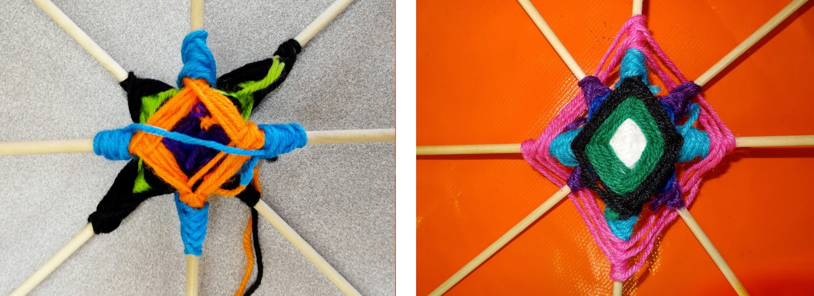
The first step is to take 2 sticks or dowels and tie them together in a cross or "x" shape. I had done this already for the students in order to save time, and they were allowed to choose 2 of these to work with. We then started wrapping the sticks in a basic God's Eye fashion. Holding the sticks, you cross the yarn over the top of the closest stick and wrap it around once (some people prefer to do this twice). Then bring the yarn to the next stick and do the same thing. Repeat this over and over until you have a diamond shape in the desired width.
To change colors of yarn, you can either tie the old color to the stick and tie on a new one, or tie the two colors of yarn together and keep going. Sometimes you need to trim it a bit if you don't wrap it around a stick and cover it with the new yarn.
Once you have a central diamond that is about 2" wide, do the same thing to your second set of sticks. It works best if the second diamond that will go in the back is slightly larger than the first set. Lay them, one on top of the other so that all 8 sticks are evenly spaced.
make two God's Eyes separately, then place together
Now you have to start securing the two sets of sticks together which can be difficult.You do this using a dagger pattern. Tie your yarn to one of the sticks, then bring it across the back to the stick directly across from it, and wrap it around that stick twice. Run it back to the original stick on the opposite side, and wrap it around that one twice. Continue at least 4 times on each side or until you like the length. Repeat this process with each stick until you have a dagger pattern on all the sticks. Slowly the God's Eye will become more stable and will hold together on its own.
Starting the daggar pattern, finished daggars on back and from the front
I like to add a second daggar color to get some good depth to the God's Eye design, as I did with the green yarn below. Once you get the hang of it, then you can switch back to a regular pattern or do another pattern. The pattern below on the right is one where you skip every other stick. I did this first with one color (pink), then did it with another color (turquoise) on the remaining 4 sticks. I think it makes the daggar design pop and adds a nice layering feel.
Green daggar pattern from back, then front. Addition of an interesting design involving 4 of the sticks in one color, then repeating with the remaining 4 sticks in another color.
The students found this challenging, but it made them really think about colors and what worked together and what didn't. By adding in the dagger pattern, we created some negative or empty space, which was a fun concept for them to consider.
As you can see with the finished piece below, I continued to add a daggar pattern again before going back to the basic God's Eye pattern and finishing it off. The back (below right) is a good example of the daggar pattern from behind.
The finished God's Eye from the front (left) and back (right).
Some students wanted to stick to the basic God's Eye, some followed these directions exactly, and others did their own unique creations. I think Jay Mohler would be proud of them...I know I am! :)
MC SB
IJ NoB
MK LD
JD DK
DB BB
JV AB
NB PM
BCB DK (final)
Tuesday, October 8, 2013
Australian Aboriginal Dot Painting
What is Australian Aboriginal dot painting? It is based on the art of Indigenous Australian artists who used dots to create images from nature or dreams. X-ray art shows both the outside and inside (bones, heart, etc) of a figure.
Watch this to see an Aboriginal piece of art come to life!
We started off talking about Australian dot art and x-ray art. We looked at a book named "An Australian abc of Animals" that was illustrated by an amazing artist named Bronwyn Bancroft. Even though its an ABC board book meant for much younger children, it has beautiful examples of dot/x-ray art that apply to our project.
Students chose which Australian animal they wanted as the centerpiece of their art and traced a template of that animal. They had a choice of black or white for the background. If they chose white, the animal had to be filled in with black acrylic paint (our medium this week). If they chose black, the animal was to be painted the color of their choice.
Then they chose 3 colors for the dot patterns in the background. Using a Q-tip, they dotted paint in the first color around the entire edge of the animal. This was repeated with the second and then third color.
At this point they could continue repeating the pattern, or create their own. We had some imaginative swirls, circles, and flourishes!
Once the background pattern was completed, students moved on to creating simple, 2 color borders.
By this time, the paint inside the animal was dry, so they could start working on the interior design. This is where the x-ray elements could come into play if they chose to go that direction. Examples of x-ray parts they might choose to paint could be a heart, brains, or stomach - or they could choose to emphasize the legs on a kangaroo by painting muscles, create designs on the tail of a lizard, or patterns on the shell of a turtle. Or they could simply continue to use dots inside the animal or even just create whatever felt right to them.
LD's Platypus and JD's Turtle
MC's Koala and DB's Kangaroo
JV's Kangaroo and BCB's Goanna
MK's Turtle
We ended up with some great designs! From x-ray bones and hearts to happy smiles and sombreros, these artists showed some real creativity!
About half of the paintings had a little more work to be done, so those will get finished up during our next class or when time permits. They all look fantastic and I can't wait to see the final pieces!
I'm not kidding! There is something magical when you drop or swirl ink so it floats on water, cover it with paper, and then lift it up to see what magical creation stuck to your paper. And you want to do it again and again! Each time its new and different.
The art of marbling paper dates back to the 11th century. It started in Asia and moved through the Islamic countries and into Europe. Different styles emerged and methods were kept very secret. Today there are many methods and kits available to try marbling at home. They range from simple to extremely involved. I tried a number of these and found that one stood out as the easiest and most successful: Innovation Marbling Kit, Japanese Suminagashi. This ink goes a long way. Almost 2 kits was enough for our entire class and my experimentation at home with my kids.
Best kit I've found - available on Amazon for under $14
Paper is another big component to success. I found that calligraphy rice paper gives the best results. If you use paper that has "sizing" in it (which most do), then you will end up with a softer, fuzzy version of your design floating on the water. Copperplate paper is supposed to work well, but I had dismal results as well. Rice paper is very thin and delicate which makes it tear easily, but overall it gives the best results by far!
I didn't show the students any real marbled paper examples before they started. I think this freed them up to explore what the possibilities were. If you want to see paper marbling (in this case, Ebru, or Turkish paper marbling) in action here is a video that shows a variety of methods and finished results.
If you want to show your child examples of "professional" marbled paper, check out this video. While it doesn't show the art of making it, the finished products are beautiful and varied. Its nice that the name of each design style is given as well.
How We Marbled Paper
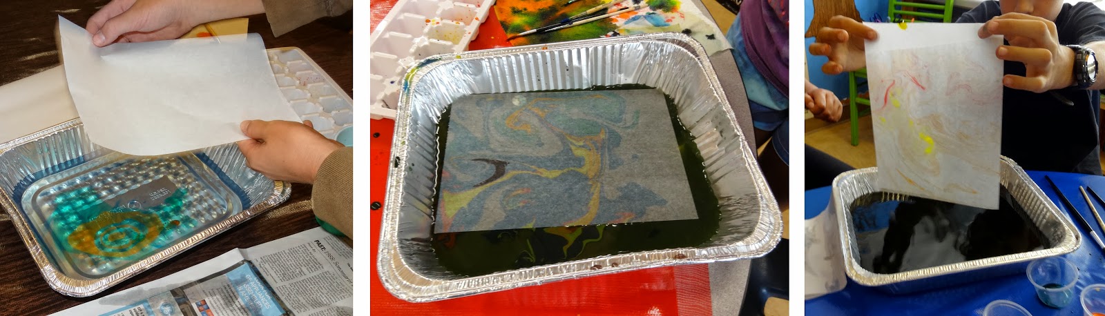
The materials we set up were: tray or pan - filled with 1-2 inches of water ink - squeeze a little of each color into 1 section of an ice cube tray - it doesn't take a lot paint brushes - 1 small brush per color to work quickly without cleaning brushes paper - sheets of rice paper cut in half paper towels toothpicks, forks,marbling combs
We started with a small
aluminum lasagne pan filled with about an inch or two of water. I tried
distilled water, but realized tap water works just as well. Don't be
disappointed if you don't get amazing results right away. We learned
that the dirtier the water, the better our results were.
Students began to add ink to the water. It is important that the ink float on the water, so you want to be fairly gentle. Any ink that sinks (and some will) won't adhere to your paper. That said, some methods employ shaking a brush over the water to get a splatter effect, so really, anything goes. That's part of the fun.
Students added ink to the water to create their designs.
Methods we talked about were dipping 1 color in, then another color in the middle of that one, then a color in the middle of that one, and so on to form rings of color. You can decide to end it there, or then use a toothpick to swirl it, or a fork or comb to brush it. Traditional Italian marbled paper is created by doing this, then brushing it one direction, then again at a perpendicular direction. You can even just blow on the ink to move it. There are many methods out there and the possibilities are endless.
We manipulated the ink with brushes, combs and toothpicks. You can even blow it around!
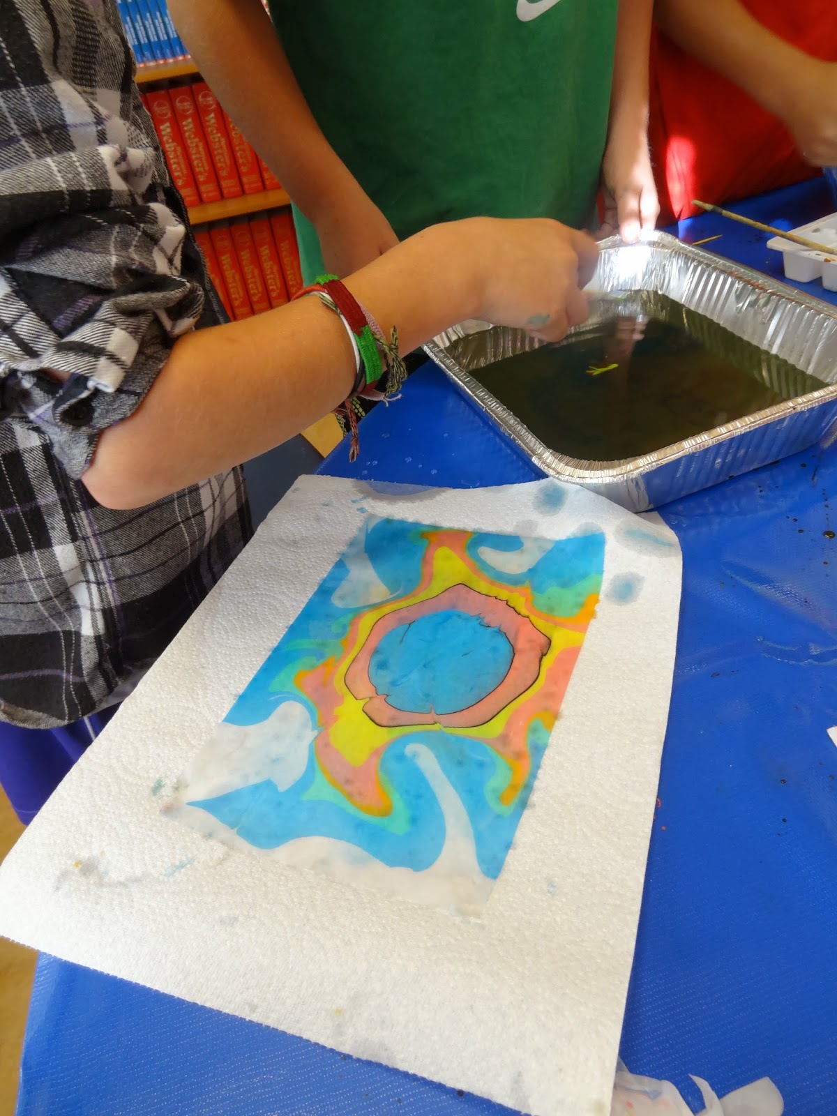
Once the students were happy with their floating design it was time to put the paper in. Our rice paper had one side that was smooth and the other was more fuzzy. The fuzzy side was the one that went into the water. They gently placed it on top. The minute it goes in, the ink sticks and you can pull it right out. You may see some light residual ink on the page, but once you lay it on newsprint or a paper towel, simply blot it off with a paper towel and that extra ink will go away. Don't worry - you can't smear or rub off the ink from the design.
Paper is placed on the water and the ink sticks to it when pulled out.
And just like that, the students made magic!
Every design is an original - as unique as the artist!
To do it again, they simply scraped or lifted out any leftover floating ink with another piece of paper and started again. Remember, the dirtier the water, the better it worked. It may take a few less than fantastic designs before you have your first masterpiece. When you do...watch out, you'll be hooked! This is something that kids of any age can do, and the prep work and mess are very minimal. Its an excellent rainy day activity, and the final art can be transformed into all kinds of things from note cards and gift tags to wallpaper. I can't tell you how excited I was to see the incredible designs the students made. And they had fun doing it! Here is a range of a few designs from each student - believe me, they are even better in real life!
AB - such intricate designs and beautiful color combinations. The first one appears so subdued but when you look closely it has so much going on. Nice work!
BB - this student has quite the eye for detailed design. She used all kinds of colors in every one of them, yet somehow made them all feel different.
BCB - nice designs, but I think she was most excited by the last one because she thought it looked like a pig's face. She has an artist's imagination!
DB - really had the alternating circles down. The middle one is gorgeous marbling! So impressive. He even has the start of a "wave" technique happening a the top of the first one.
DK - really took to marbling and showed a great range of talent. The contrasting colors are so vibrant they really catch your attention.
IJ - beautiful progression from 1 to 2 color designs, followed by multiple colors in motion. I love how airy and delicate these are.
JD - I'm really proud of this younger student who had a fantastic grasp of pattern and balance. If I didn't know better, I'd say he had done this before!
JV - love the range of super delicate to simple beauty. I was excited to see that he tried different techniques and did so well at all of them.
LD - these look like professional end papers - wow! She took her time getting used to this new art form, but once she got the hang of it - look out!
MC - great use of black to make these designs really pop, and wonderful range of style! She dove right in - enjoying everything she tried.
MK - fabulous use of color as she progressed into bolder designs. She did so well that she was able to work with another student to show him the ropes.
NB - another example of a student who tried all kinds of styles successfully. I did a double take when I saw the last one - it looked like she had outlined this with a sharpie!
NoB - beautiful and delicate all the way to large and bold - she really got a feel for marbling! It was great to see her get more and more at ease with this as time went on.
PM - I was so excited to see that while he started off being very conservative, his art literally exploded by the end of class, becoming bold and dynamic. Way to go!
SB - So impressive how he nailed the circular forms and then pushed it to new levels as he got more expressive and comfortable doing this.
Don't Try This At Home
I did try some other, less successful methods of marbling and wanted to share with you in case you are tempted to shop around.
I tried the method where you mix regular cooking oil with food coloring. The results were bright, but didn't look like marbled paper at all. I found that I couldn't play with the "ink" like I could with the kit we used.
Oil and food coloring - doesn't look like marbling!
Jacquard Marbling Kit - this was a lot of work with dismal results! I felt like I was in a chemistry lab - mixing the solution that goes in the pan and the solution that you spray on your paper to make the ink stick. After all that prep work, then the ink seemed too thick and was not easy to work with. When the paper was pulled out of the tray, the ink ran and didn't stick.
The results were not worth all the effort that went into this kit!
I've tried the shaving cream method long ago where you put paint on top of shaving cream then press paper onto it. I found the smell overwhelming. I think the results were ok, in a messy, toddler kind of way.


